Since 1994
The Grand Central Art Center has been dedicated to the investigation and engagement of contemporary art and visual culture – regionally, nationally and internationally – through unique collaborations between artists, students and the community.
In other words,
They make viewing incredible art available to the public for free, and creating incredible art available to students and artists from around the world for free.
Objective
Identify the pain points of their current website.
Test parameters
What: Grand Central Art Center site
Who: UC Fullerton Students
Where: UC Fullerton
Test tasks
1. Find out the hours and locations of the gallery
2. Find what exhibits are showing in the gcac galleries
3. Find programs they offer
(Tasks were determined based on the essentials needs of the director the art gallery along with his staff.)
Processing
Reviewing notes, identifying the main difficulty, and prioritizing.
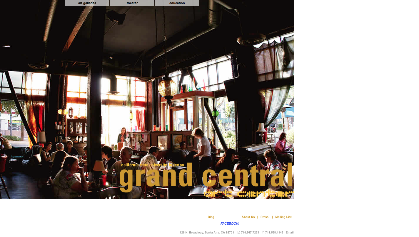
1)
-Page height too long, couldn’t see address
-Not on home page
-Only on two pages
-Not text on home page so couldn’t ctrl+f for it
2)
-Art galleries don’t indicate where they are
-There is no schedule link under galleries
-No one place to see what is showing at all of the galleries in the art center
-No calendar
-Blank pages
3)
-No programs link in main nav
-Is theater a program?
-Not sure if after school program is part of gcac or just happens there
-Not sure if after flamenco program is part of gcac or just happens there
-Blank pages
Finding Key Issues
LOCATION
Users expect an easy to locate address on all pages that is clickable.
“I can’t…click on it.” Click, click, click.
74% of adult smartphone owners ages 18 and older say they use their phone to get directions or other information based on their current location. So it comes as no surprise that users expected the address to GCAC to be clickable; at the very least, selectable and easy to find.
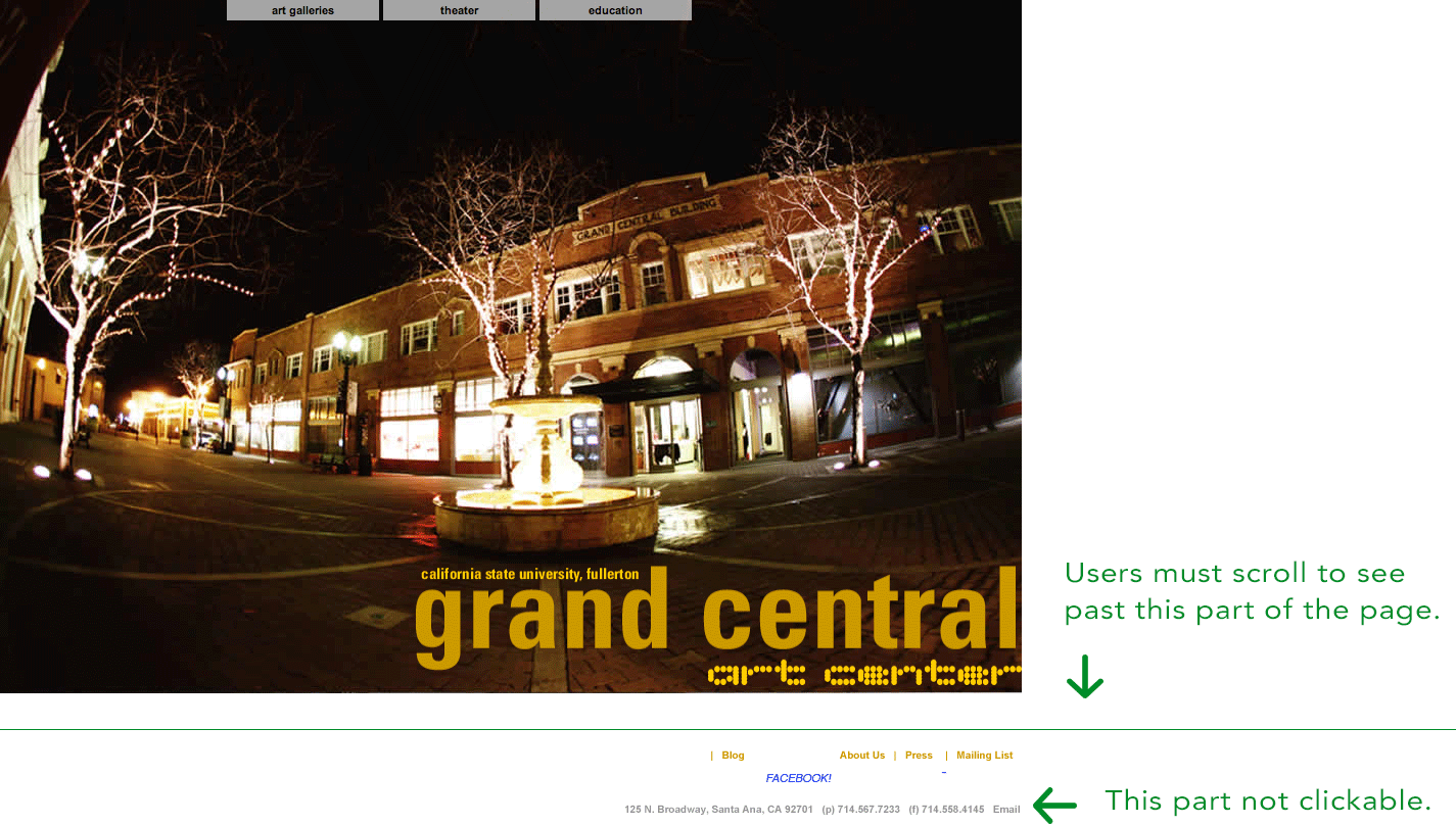
RECOMMENDATION: Replace image of address with actual code. Make more prominent. Allow users to get directions in app if on mobile.
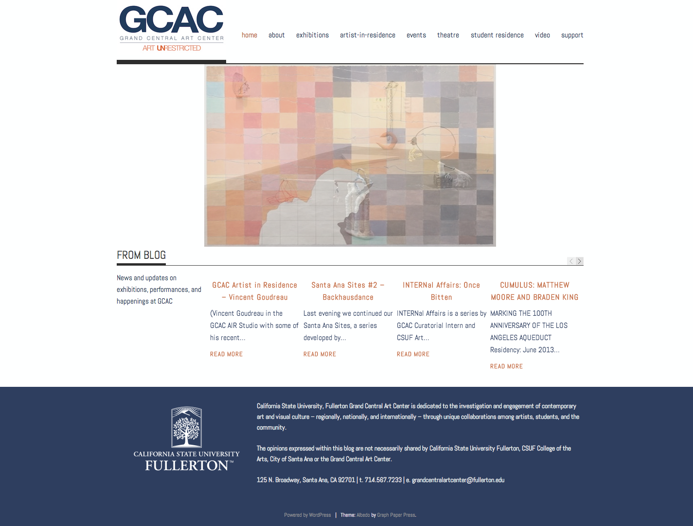
SCHEDULE AND GALLERIES
Users expect a list of events and gallery locations.
Oh, here they are. Wait no. There are more. Wait, are these at the same place? How do I know where they are?!
There are 3 links under the top navigation. They all have submenus, but only one has a schedule link and it’s not for galleries. The only way to find out what exhibits are currently showing at GCAC is by going to each gallery link, and looking at all the past and future shows. Even when users do this, there is no indication whether a gallery is located at GCAC or somewhere else such as the Fullerton campus.
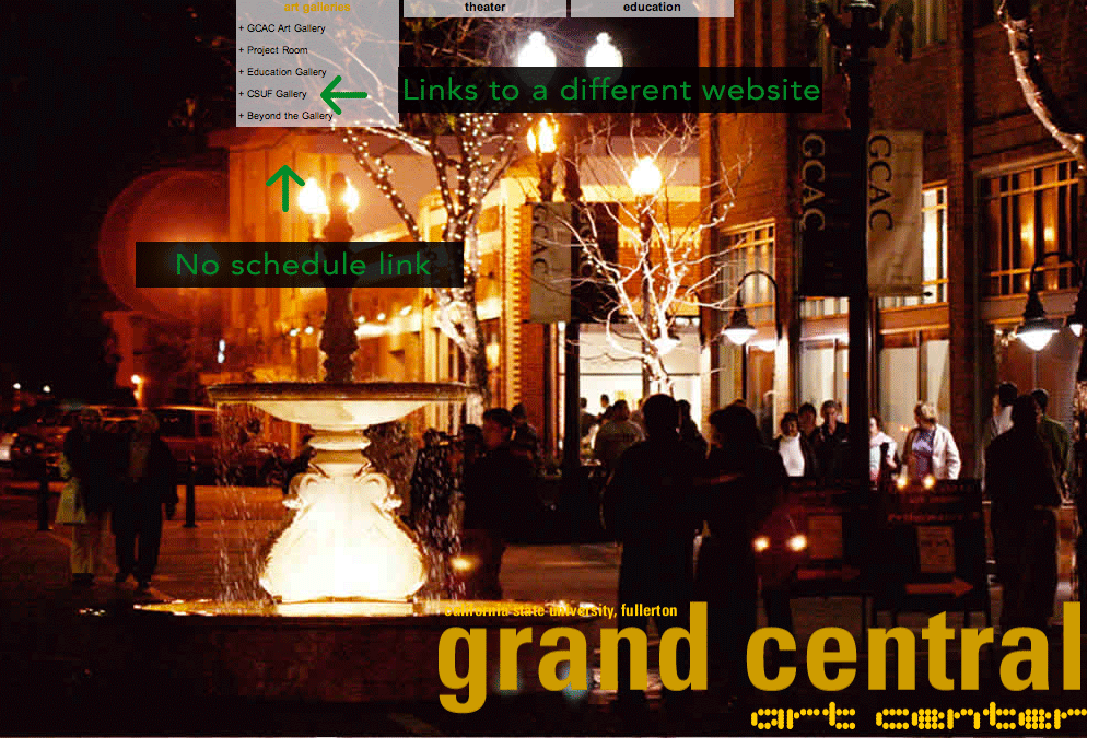
RECOMMENDATION: Create one page for schedule for all galleries. Add location to individual galleries page.
PROGRAMS
Users expect like things to be grouped together.
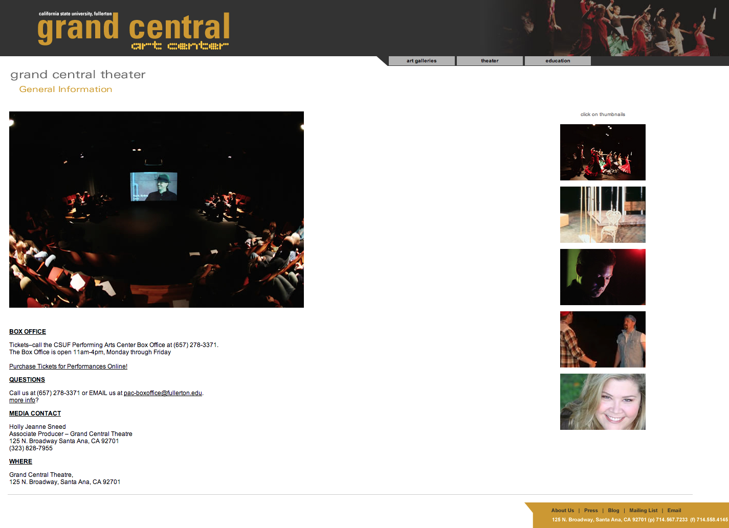
I wish all the program pages looked like the theater page.
Why does is theater separate?
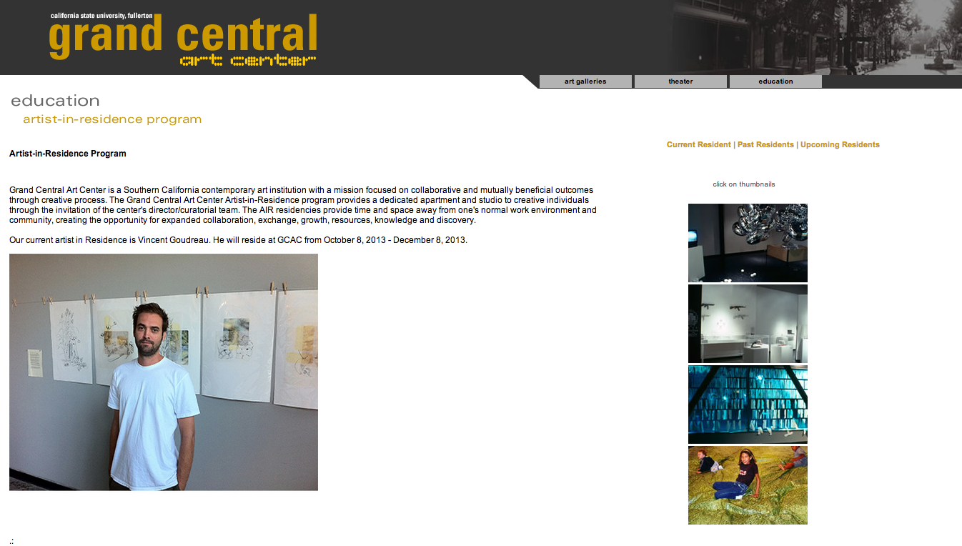
GCAC has 3 programs: theater, artist in residence, and a graduate student program. The theater page is not only separate in the navigation but it has the most information. The artist in residence program doesn’t give any instructions on how to apply. And the rest of the programs under the education tab are not part of GCAC, they just take place at that location.
RECOMMENDATION: Change theater tab to programs, put all program links there.
But We Can’t Forget the Client
Meet John. John wants his users to be happy. But John also wants a few other things.
John’s Needs
1) People to come to GCAC
2) To promote the artists in residence program
When people are deciding to go somewhere they want to know, where it is, how to get there, a phone number in case they need it, and what is going to be happening there.
RECOMMENDATIONS: Schedule and clickable contact information easily accessible on every page.
Currently, the artists in residence program is hidden under layers of navigation and there is no indication that this program is more important than the others.
RECOMMENDATIONS: Make the program a top level navigation link.